With Windows 10 Fall Creators Update, Microsoft introduced its vision for the future of user interface design. You can now see the fluent design in the Start menu, Action Center, Settings app, Share flyout, Microsoft Edge, Photos, and in other apps. If you are not happy with this revamped look of apps, here is how you can get it of it.
What is Fluent Design
Fluent Design is Windows 10’s upcoming UI, previously known by its code name “Project NEON”. It is a new design language which is focused on simplicity and consistency along with cool animations. It also adds Windows 7’s Aero Glass-like effects to the Universal app frame and controls.
Key aspects of the Microsoft Fluent Design System are as follows.
Material: A graphical solution which emulates the “sensory and invigorating” feel of the materials that things around us are made of.
Motion: A set of animations which give an idea on how to interact with new UI elements like an app menu opening or drawing the user’s attention to controls and flyouts which appear on the screen.
Light: Soft highlights of important buttons and features to draw the user’s attention.
Depth: Transition animations which make an impression of opening the next level or layer of data presented by the app.
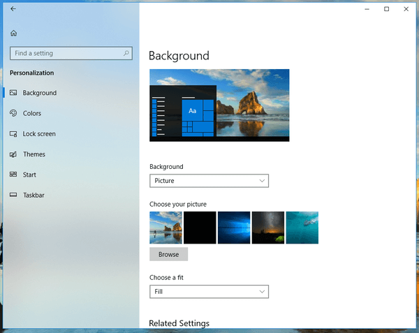
The following example shows Fluent Design elements in Settings. Early, the left pane of the app had a solid white background. In recent versions of Windows 10 it supports acrylic and you can now see the fluent design in the Settings app.

If you don’t like the fluent design, here is how to disable it.
Disable The Fluent Design In Windows 10
- Open Settings
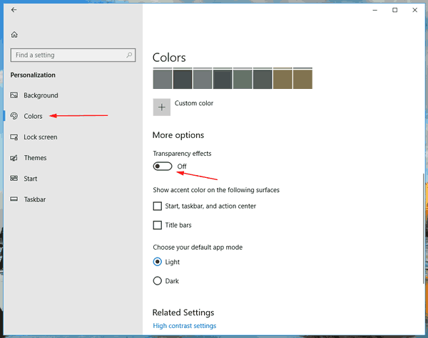
- Navigate to Personalization > Color.
- On the right, under ‘More options’, disable the option ‘Transparency Effects’.

- The fluent design will be disabled instantly.
Microsoft may or may not apply the Fluent Design to apps and places of the operating system, but the new UI looks very special and may not fit everyone’s taste.
Note: Turn on the Transparency Effects option to restore the Fluent Design visual effects in Windows 10.
